
We’ve been waiting for this to happen for a very long time and today Instagram is taking everyone by a storm with this gorgeous redesign. It’s not only a rebrand of the logo but also the entire line of products including Boomerang, Layout and Hyperlapse. On top of that, they also did a redesign of their beloved app as well by adding a much simpler look/approach with a Black & White UI. What do you think?

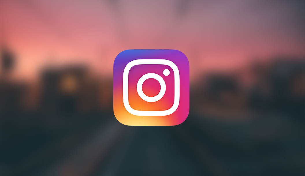
Major overhaul on the icon with a flat approach on the logo with a vibrant gradient to support it. Does it mean that gradients are definitely back again?
The App hasn’t changed that much if you’re talking about functionality. But the overall UI look has changed.